

Do you want to send packages simply, quickly and cheaply? Postpony makes it possible.
This international player from Beijing makes the logistics process of shipments between China and other countries a lot easier! Postpony works with international courier companies such as FedEx, UPS and DHL and offers users the best shipping option.
In order to be distinctive and recognizable in the market, Postpony created a demand for an visual identity and improvement for the user-friendliness of the interfaces.


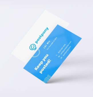
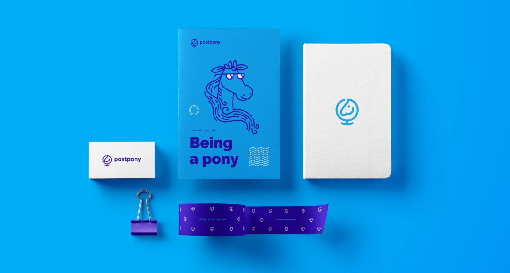
Pony’s? Yes, it is! By hearing the name ‘Postpony’, the basis of the logo was quickly clear to our designers: A pony. When the pony entered the sketching phase it was accompanied by the characteristics of global and logistics. The logistics process is visualized by creating movement in the design with shapes and lines. These visual features have also been implemented on the website, where the shipping process is explained simply by using icons. At the back of the website, we also improved the user interface. To optimize the usability, a simple navigation structure and a clear interface have been chosen.

With each design our designers deliver, we strive to make the customer proud. We look for boundaries, but at the same time ensure recognition. For Postpony, we delved into the Chinese market and we got inspired by Chinese cartoons. The result? A playful design that, thanks to the use of icons, radiates positivity and ‘fun’!


Swytch

Brothers and Sons
