

A timeless, daring, innovative and sustainable design. That’s Brothers and Sons! The creativity and passion is in the blood of these Tilburg furniture makers.
Brothers and Sons designers are determined to create groundbreaking designs. They constantly push their limits. And such designs deserve a stage, right!? It’s up to Doop to give substance to this case.

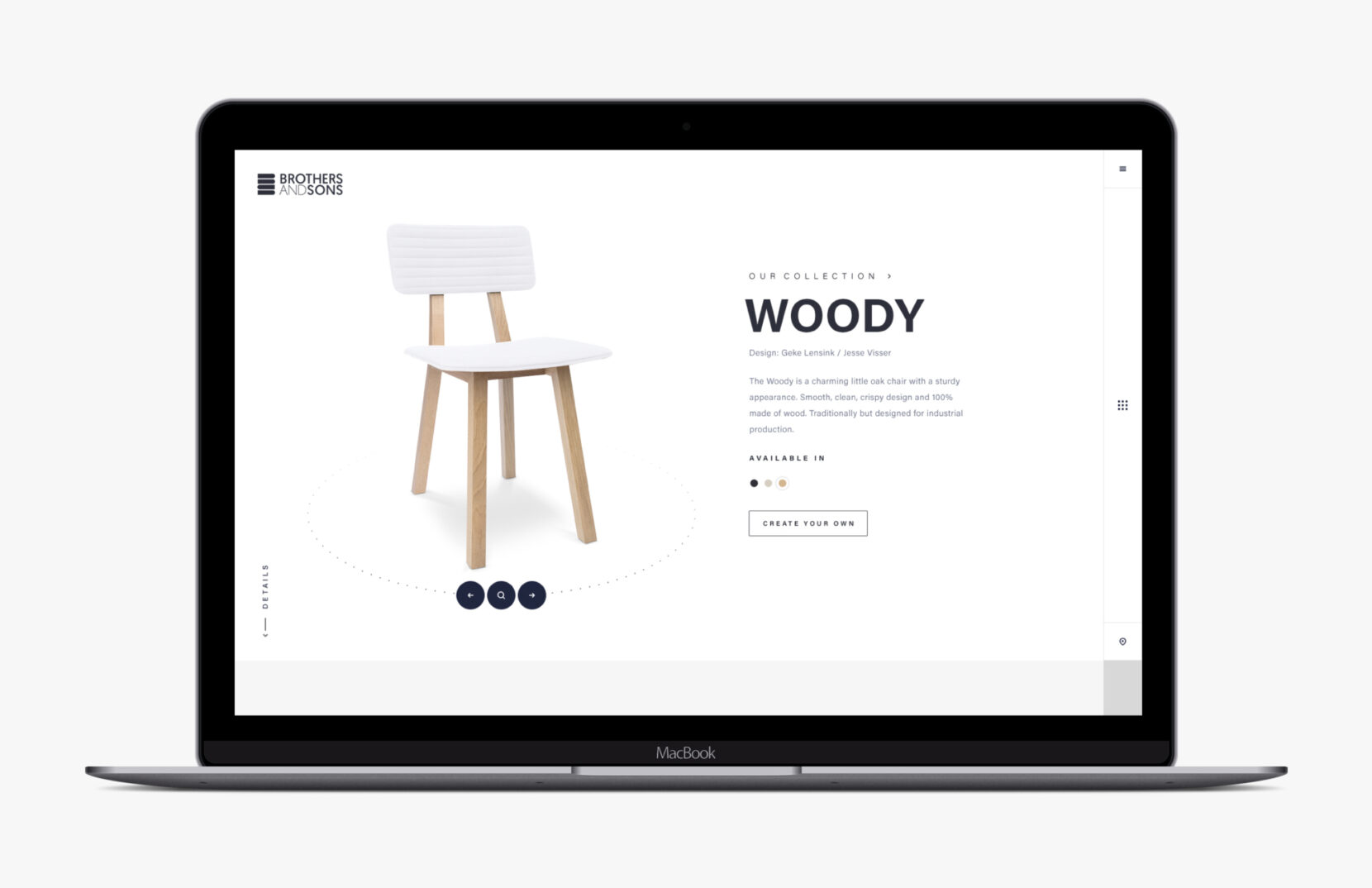
We built this stage in the form of a website. To emphasize the features of the “Brothers and Sons” designs, we have created a simple and sleek design. Minimalism and a lot of space and attention to the products. The website breathes Brothers and Sons.
Each product has its own landing page. This way, the product gets all the attention it deserves and details are exposed. In addition, all products can be viewed in 3D and visitor can personalize the models by choosing their own color and material. This ensures an optimal user experience!
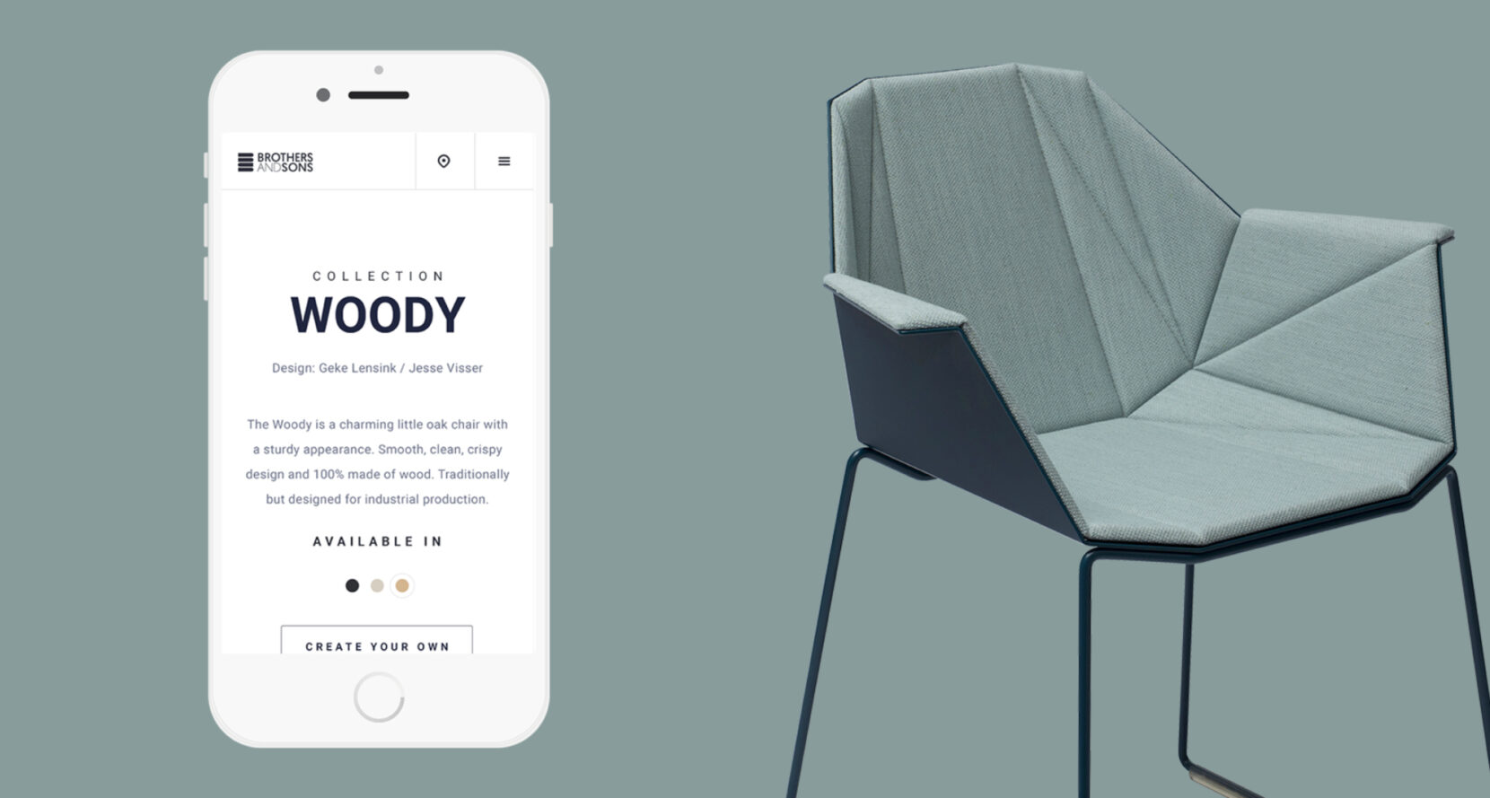
At Doop we try to push the limits on every device. Even when it comes to mobile solutions. The experiences that desktop offers must also be mobile, for a synchronous online experience.


