

Mailosaur's technical tool is used to test, check and scan emails so they don't end up in the recipient's spam box. It is a product for anyone who builds, tests or presents products such as QA & Development teams.
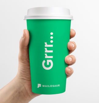
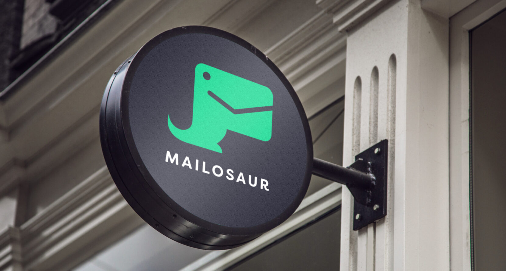
Mailosaur was looking for a visual identity that can be used both online and offline. In brief; Up to Doop to give this dinosaur an identity!

Well we were lucky, because the powerful name that appeals to the imagination was already there. The challenge was to merge a dinosaur with an email symbol into one recognizable shape.
The first part, sketching. This phase is the most creative phase in which we put our heads together to excite each other and come up with the most raw ideas. Then it is time to form the lines to the first functional concept. Mailosaur enthusiastic? Well let’s work it out! We took a big step towards a digitally and graphically recognizable logo, so that the end product slowly started to take shape. We asked the customer for some last feedback, put all focus on the last details And ready to use!

An effective illustration style, with the dino as the central focus! A logo that makes everyone happy and an illustration style that demonstrates how cleverly the concept works without any explanation. And because “Nothing more to do” is a quote that does not suit Doop, we have deliberately chosen to keep the house style open for interpretation. Logo, typography and color are the rock-solid elements that ensure recognisability. This way the style can move with the times and there is room for new creative interpretation.


