
With personal attention, good guidance and expert advice, Keerpunt ensures that people return to work and continue to work sustainably. At Keerpunt they believe that everyone can work in a healthy way. That is why they look at what is possible and how the consultant, employer and employee can organize this together.
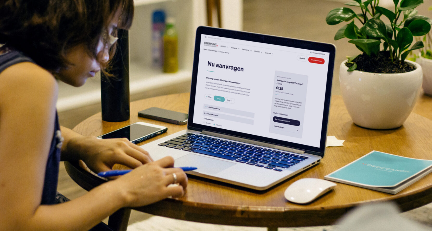
Keerpunt offers sustainable solutions for issues in the field of healthy working, from health and safety service to laws and sick leave. They collaborate with various partners such as insurers and sector organizations. Keerpunt is currently in a transition from a business model in which they have become one of the health and safety services from which insurers and customers can choose. They are no longer automatically included for case management, which means that Keerpunt must compete and transform into a commercial way of thinking. The first aspect where improvements can be made is the website. Our experts have the task to transform this site into a unique, clear and refreshing end result.
First things first, a brainstorming session with Keerpunt in which all desired functionalities and requirements are discussed. Based on these results, a UX Strategy Guide has been developed. This Strategy Guide is the common thread in the strategy of the site; what are opportunities, where do we see obstacles and where are we going to implement changes? Based on this strong foundation, the strategy can be further elaborated in specific areas such as; the structure, navigation, sitemap and architecture.
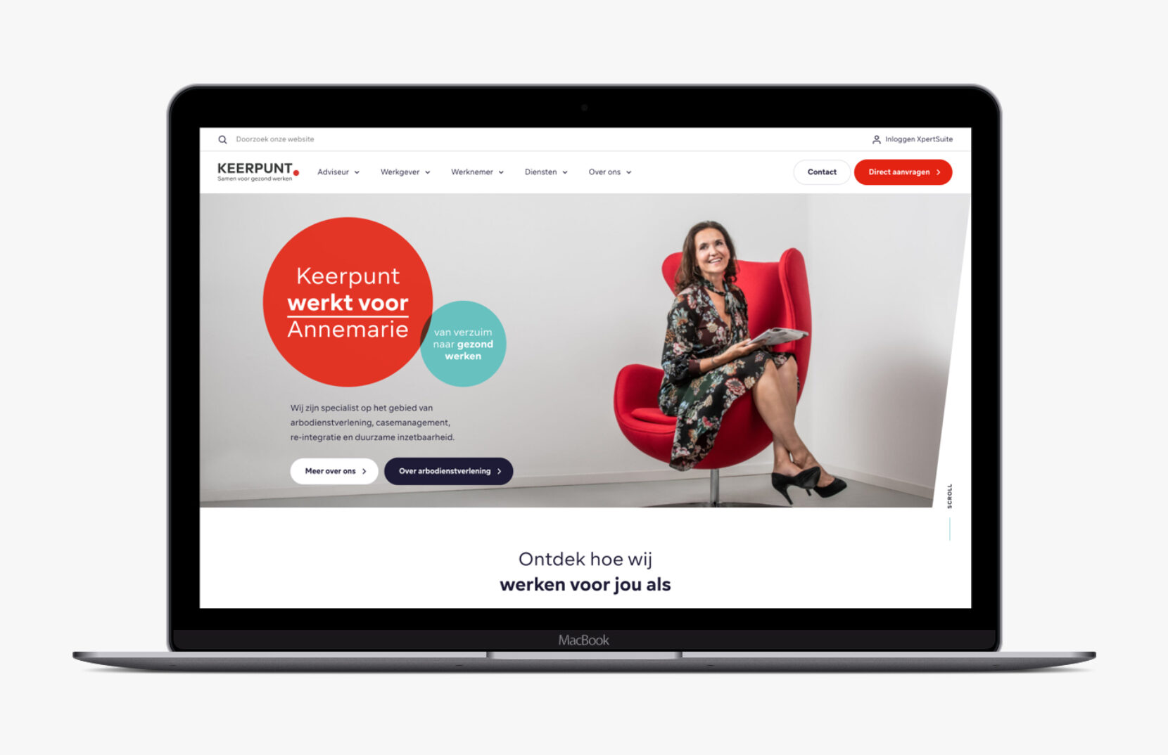
Then, design magic! First of all, the concept design is made to match the visual identity of Keerpunt. After sparring with the customer and drawing up various concepts, the wireframes are fully developed. The end result slowly comes into view! But it didn't stop, next point of attention: brand awareness. To increase brand awareness, various animations were made which were then pushed sponsored via social media.
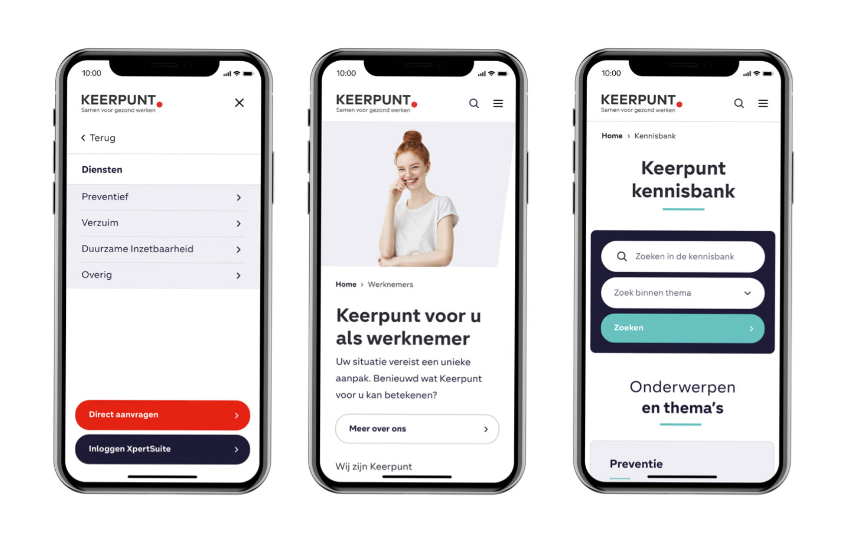
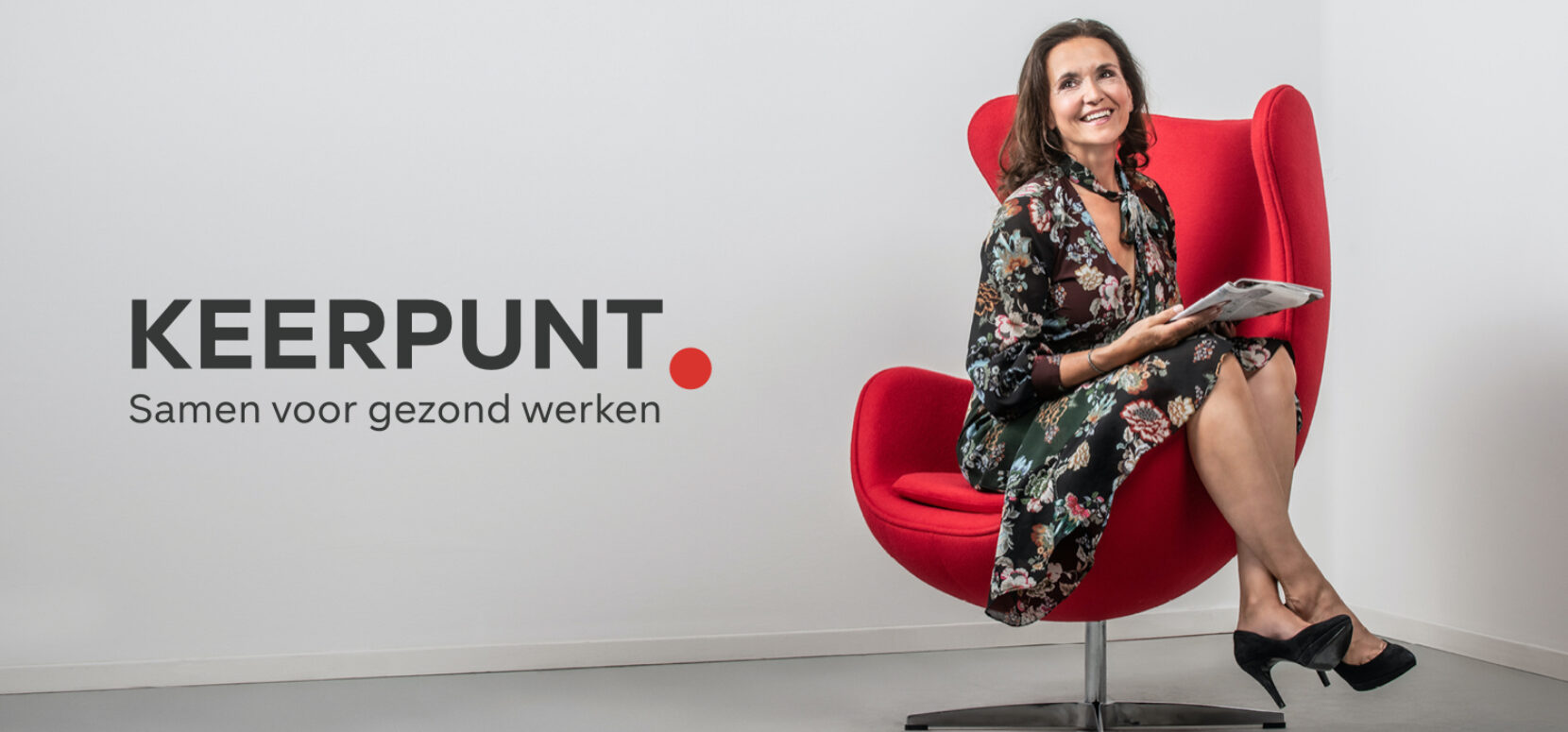
A powerful and clear platform, specified per target group. As a consultant, employer or employee, you can easily find the information that is relevant to you. The red dot from the Keerpunt logo has a powerful leading role in the design of the website. Different models that are representative of each target group have been photographed, sitting into a red chair. The brand awareness campaign has also achieved good results and generated many positive reactions. In short, Keerpunt literally prints a point of recognition in their industry!
